How we look
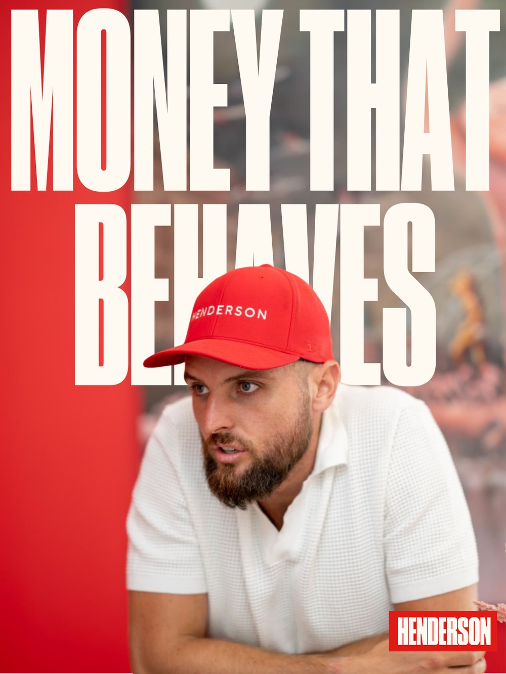
Red leads. Bold and simple, as simple as possible. Heavy condensed type with energy, in-your-face headlines that take a stance, and a red block reversed out in white. A more masculine, dominant presence than the category is used to.
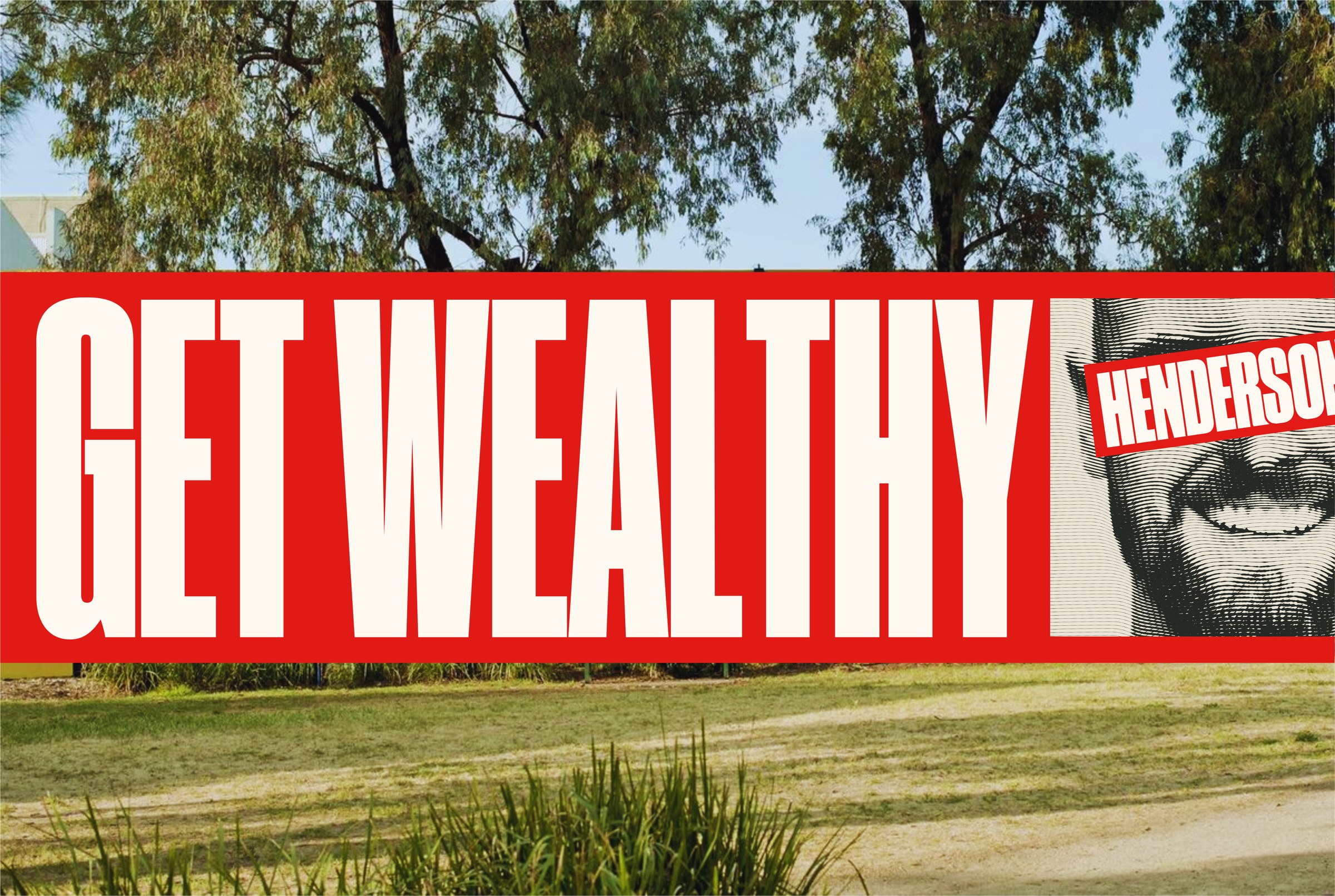 Site signage
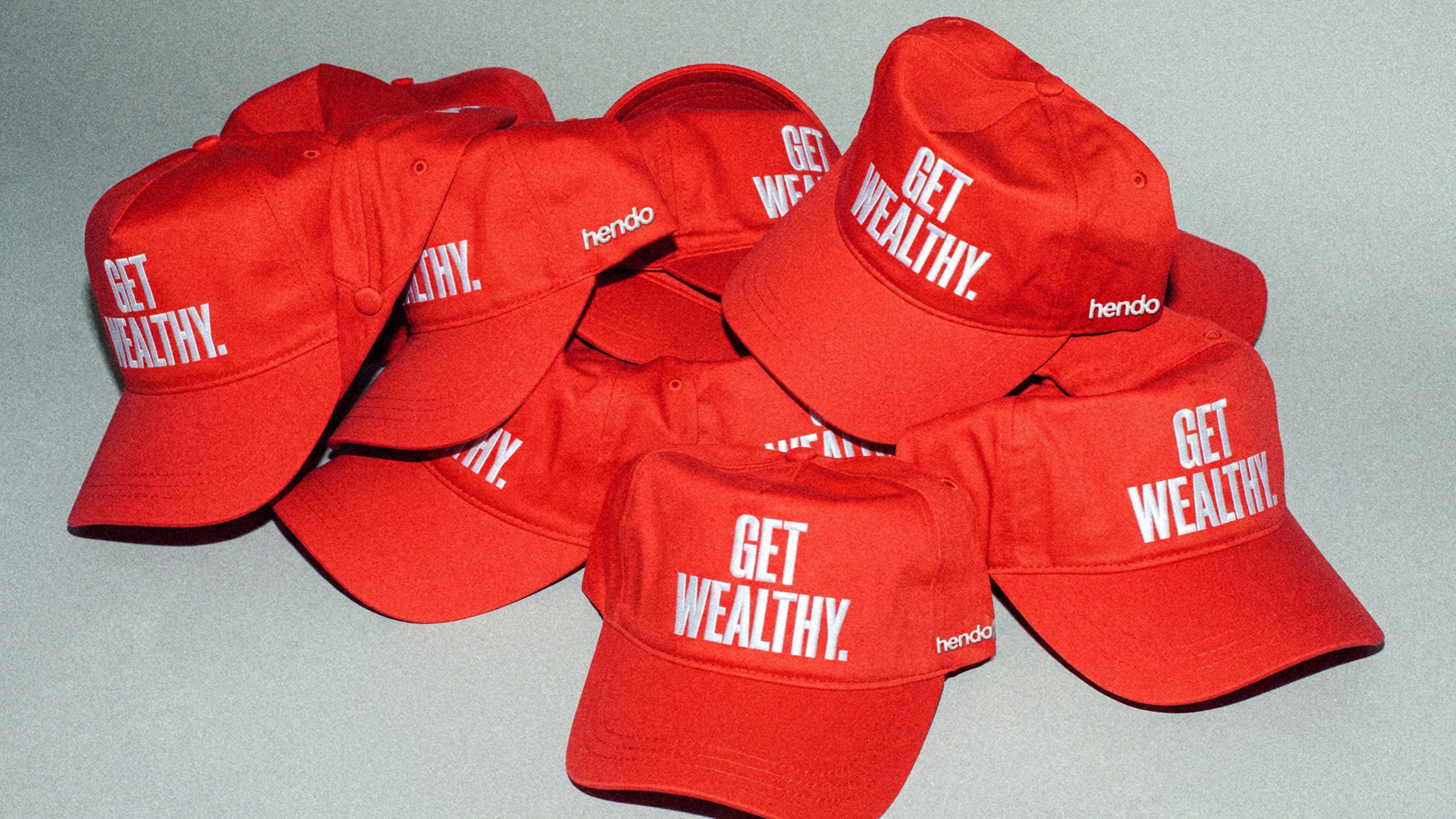 Merch
Logo system
One wordmark, two speedsThe logo is the core identity of the brand and its primary visual anchor. It is the name, set in Druk, inside a block. Simple, recognisable and adaptable across digital and print. It is redrawn in a new style from the previous serif-led mark and the red jellybean dot has gone.
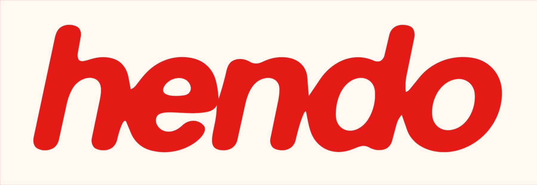
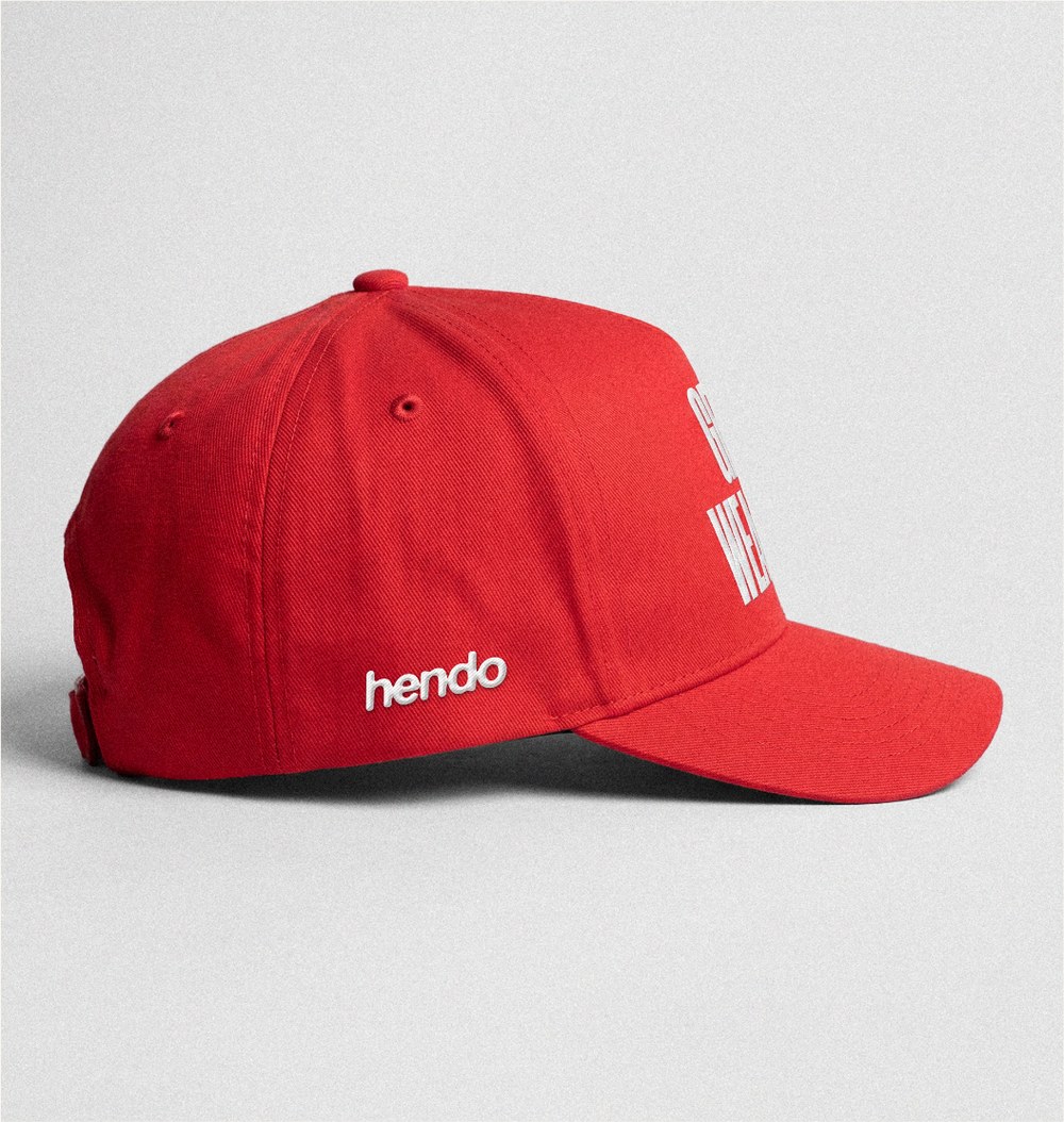
Secondary mark: hendo
Merch, events, cultureA two-speed brand. hendo is the unexpected secondary mark for signage, merch and events. Rounded, friendly and lower case on purpose; the contrast with the primary mark is the point. It never replaces Henderson on advice, services or client communications.
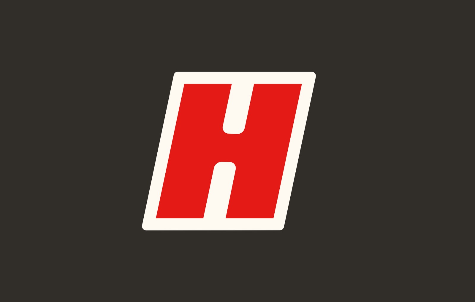
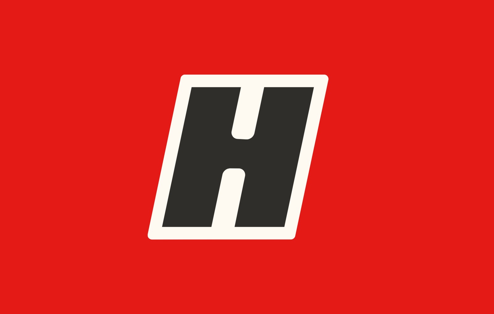
Brand mark: H
Icons, avatars, patchesThe H is the brand at its smallest. A bold, slanted initial in a cream keyline, used where the full wordmark won’t fit: social avatars, app icons, favicons and embroidered patches.
Clear space & minimum size
- Clear space on every side equals the cap height of the H.
- Minimum width 24mm in print, 110px on screen.
- The block always has square corners.
Don’t
- Don’t track, stretch, skew or outline the wordmark.
- Don’t set it in another typeface or add a period, dot or tagline inside the block.
- Don’t round the block or place it on photography without the block.
Colours
Red leadsThe palette defines the emotional tone and visual consistency of the brand, and it is deliberately small. Red is the hero and carries the energy. Off white and charcoal give it room. Grey and white are support only.
Weighting & pairs
How much of eachFour pairs, and that’s the system. Red type on charcoal and charcoal type on red fail contrast and aren’t used. No gradients, no tints of red.
Typography
Two faces, two jobsTypography plays a key role in expressing the brand’s tone and personality. Druk Condensed does the shouting. Bricolage Grotesque does the explaining. Nothing else is needed.
Layout
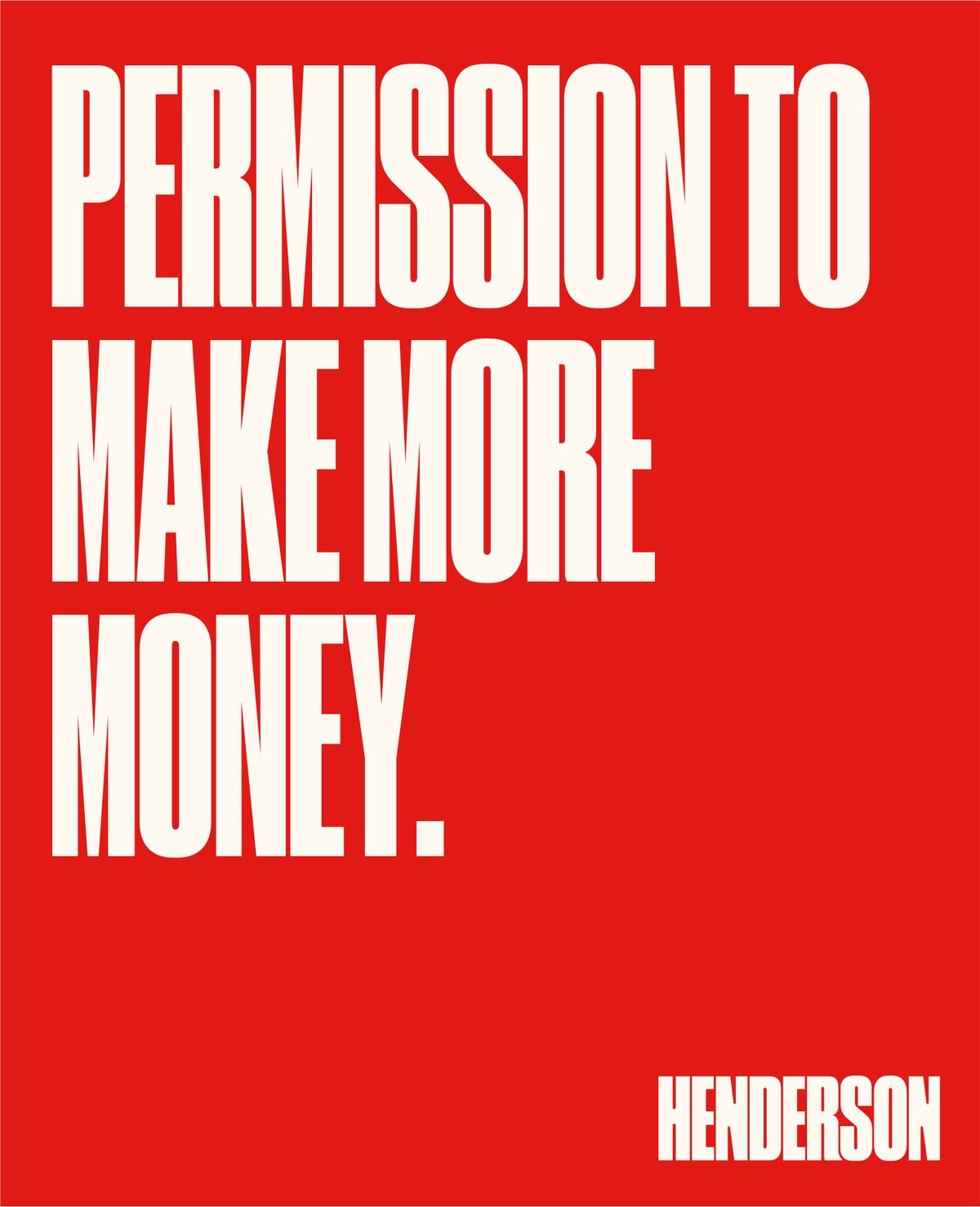
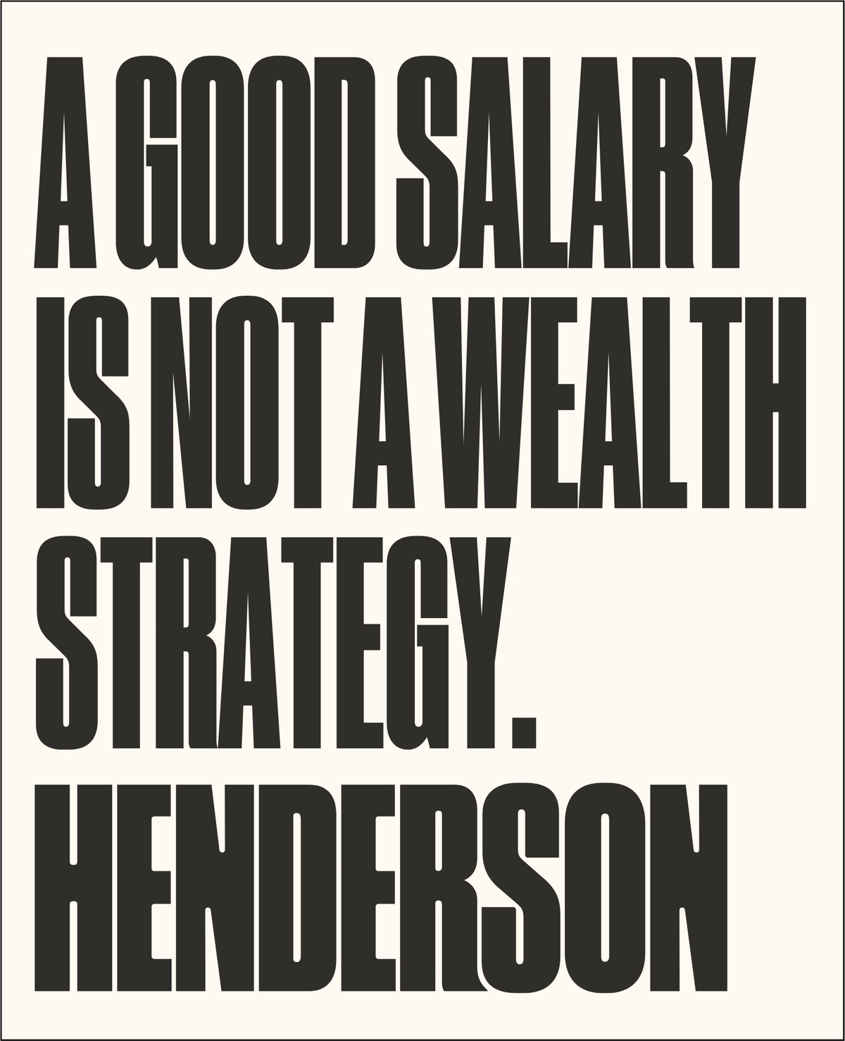
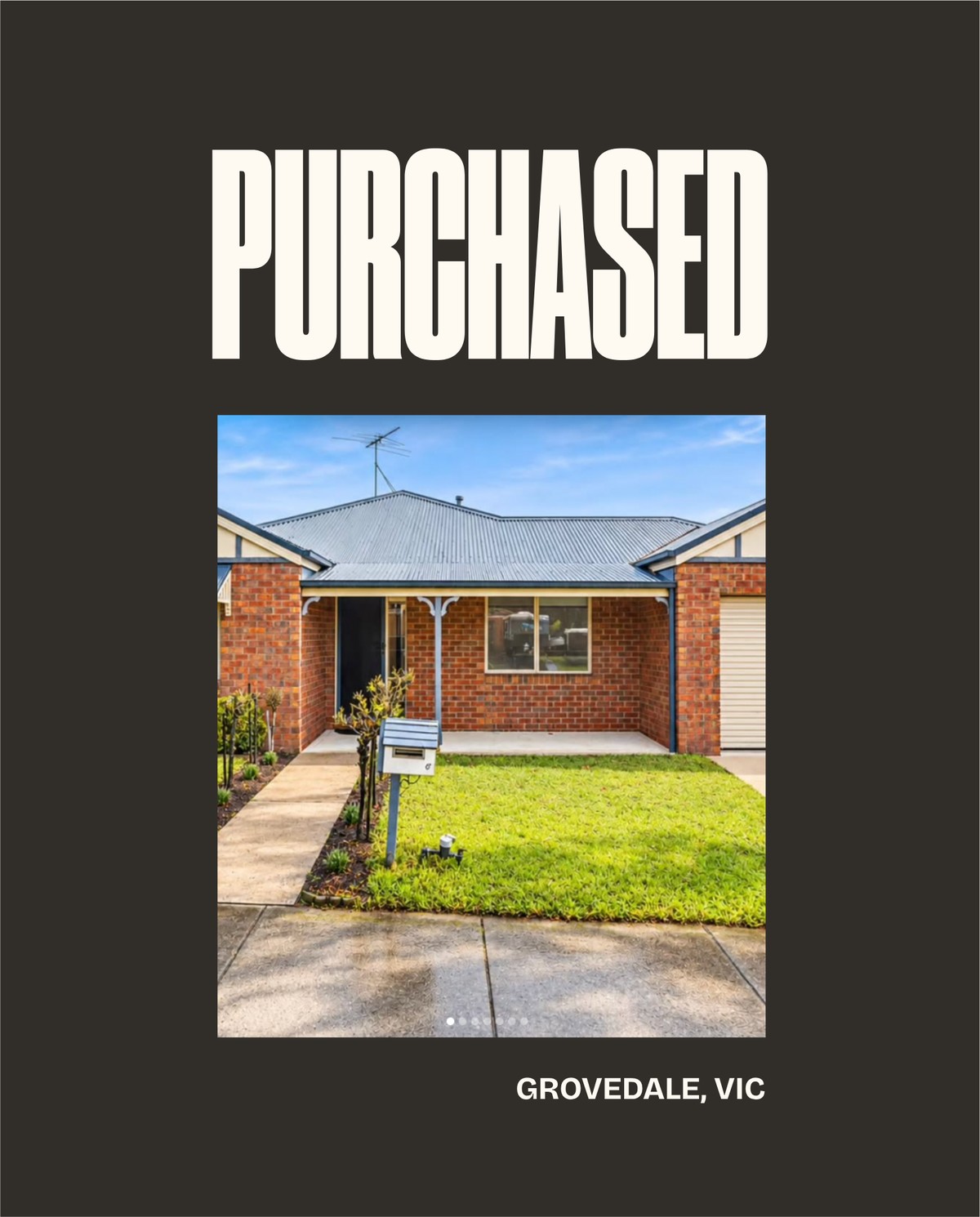
The poster principleEvery layout is a poster first. One headline, one block of colour, one image if it earns its place. Type runs edge to edge, sits top-left or bottom-left, and is big enough to read from across the room. The wordmark goes in a corner, small.
Art direction
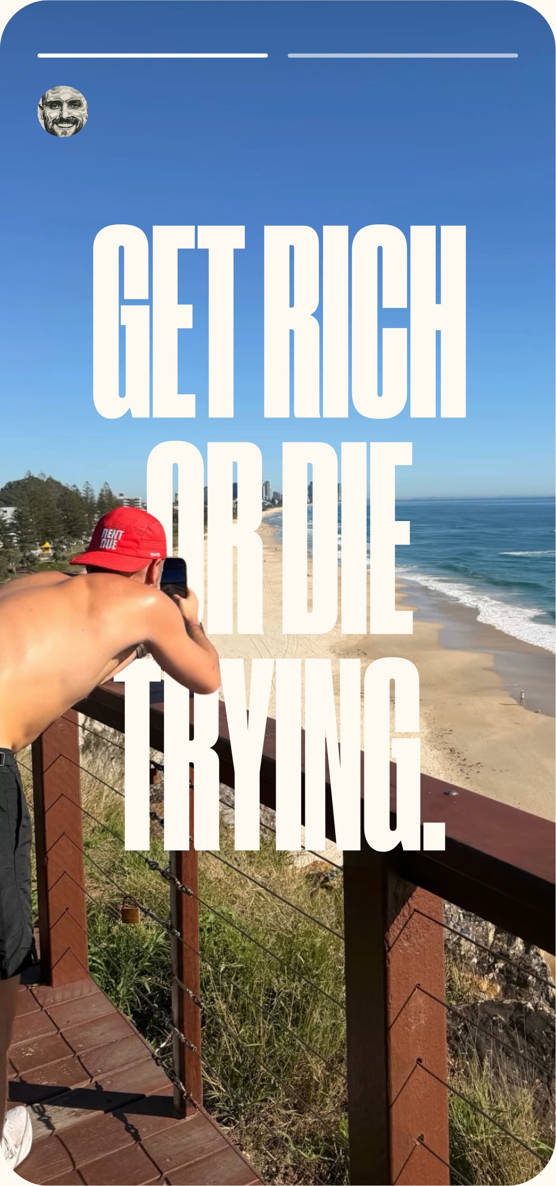
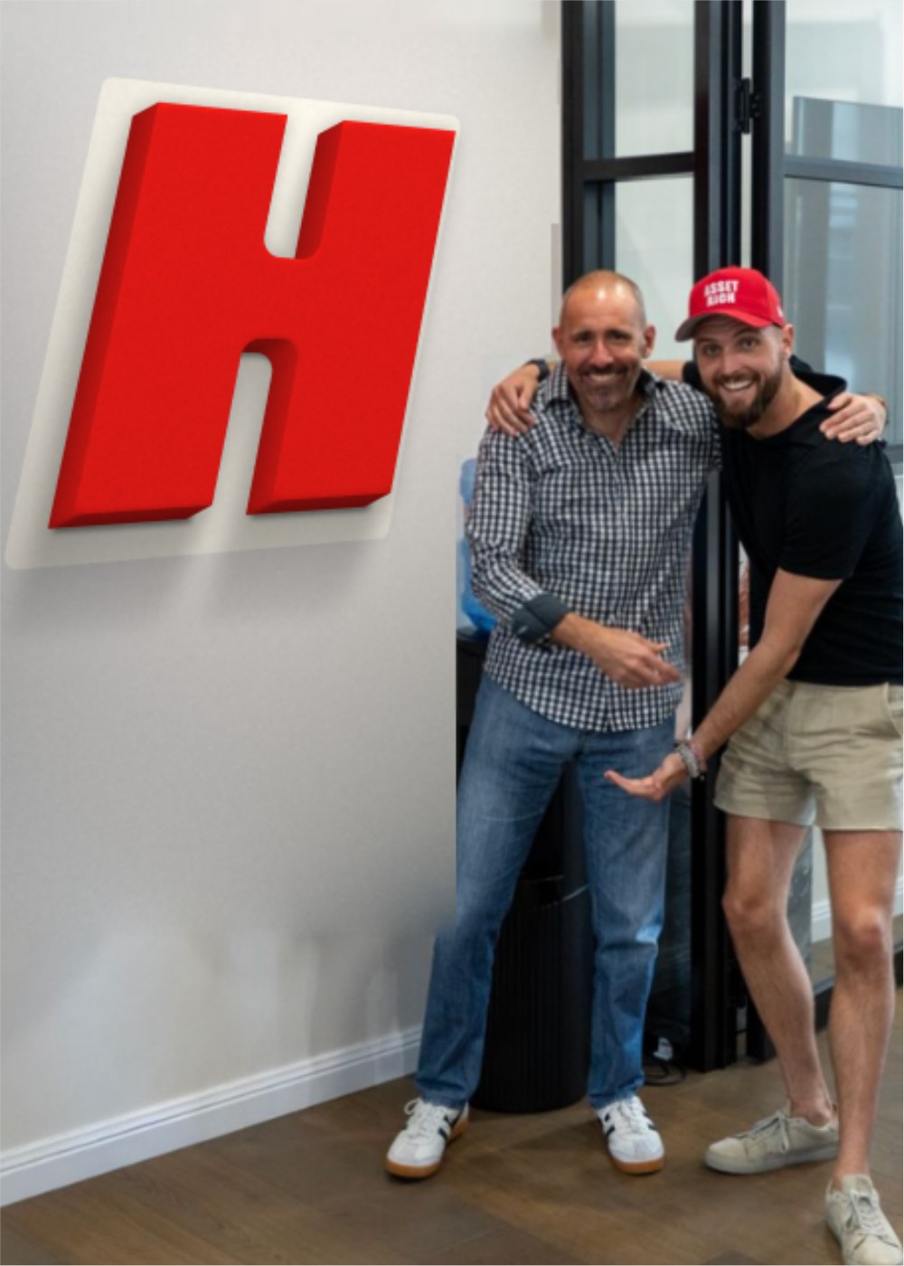
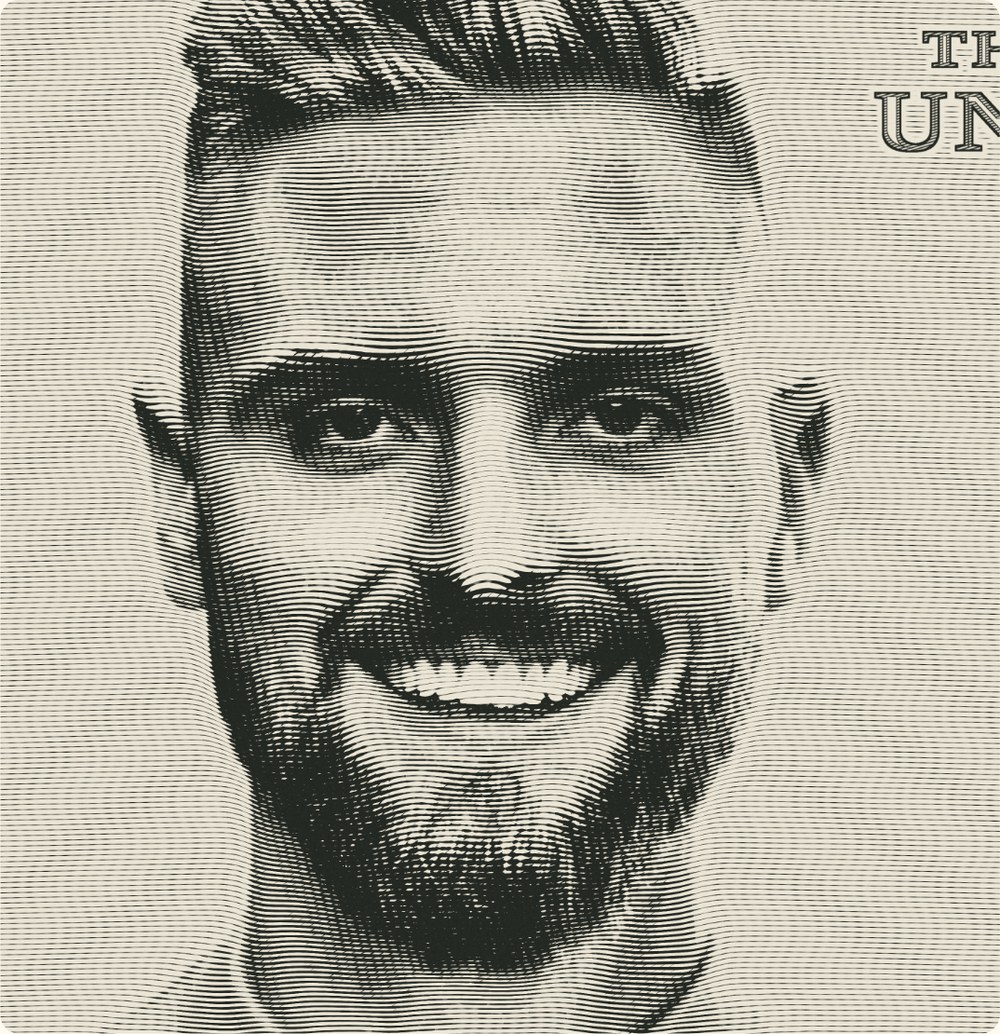
Photography & imageHenderson photography is candid, not overproduced. Shot off the cuff, on the phone as often as the camera: Jack mid-conversation, the team in the office, a cap on the bench. If it looks like it took a crew and a lighting rig, it is the wrong shot.
Henderson ecosystem
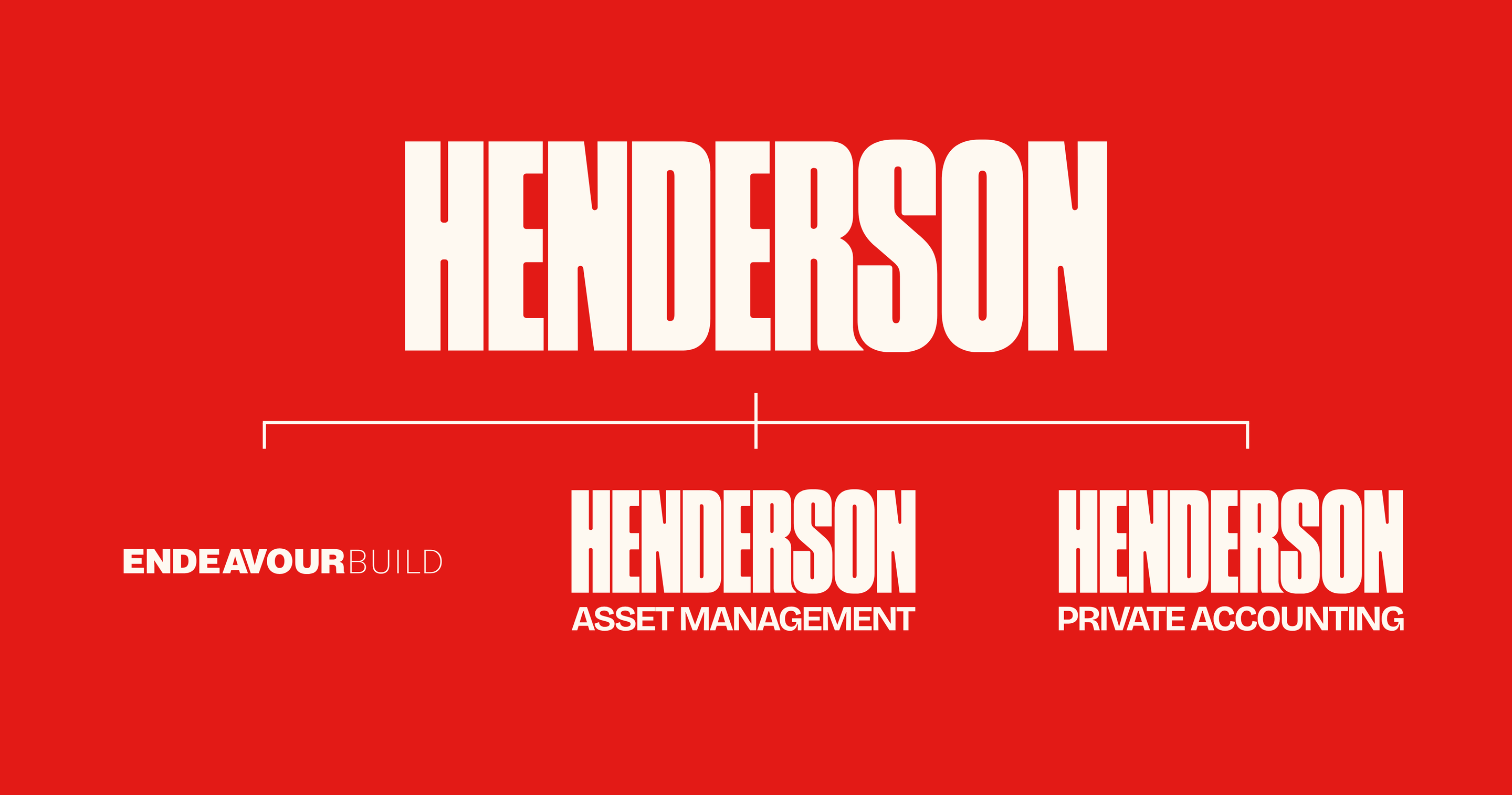
One master brandEvery service sits under one confident master brand. Sub-brands take the wordmark and add a descriptor in Bricolage Grotesque; Endeavour Build keeps its own name but lives inside the same red.